Reebok Smart Ring
Premium 3D Product Visualisation
Project Overview
Most wearable products look technical.
Few feel desirable.
The Reebok Smart Ring sits in that space. It tracks performance, recovery, and daily activity, but it’s designed to live on the body, not just in the gym.
The goal wasn’t just to visualise the product.
It was to position it.
Not as a gadget.
As something people choose to wear.
The Challenge
The challenge wasn’t visual.
It was perceptual.
The product had to communicate performance without becoming aggressive.
It had to feel minimal, but still engineered.
Too technical, and it loses appeal.
Too soft, and it loses credibility.
It needed to sit in both worlds.
Direction & Visual Strategy
Before any rendering started, the direction had to be defined. Not just visually. Strategically.
The product already had clarity in design.
The role of the visuals was to extend that clarity into perception.
So the first step was building a controlled visual system.
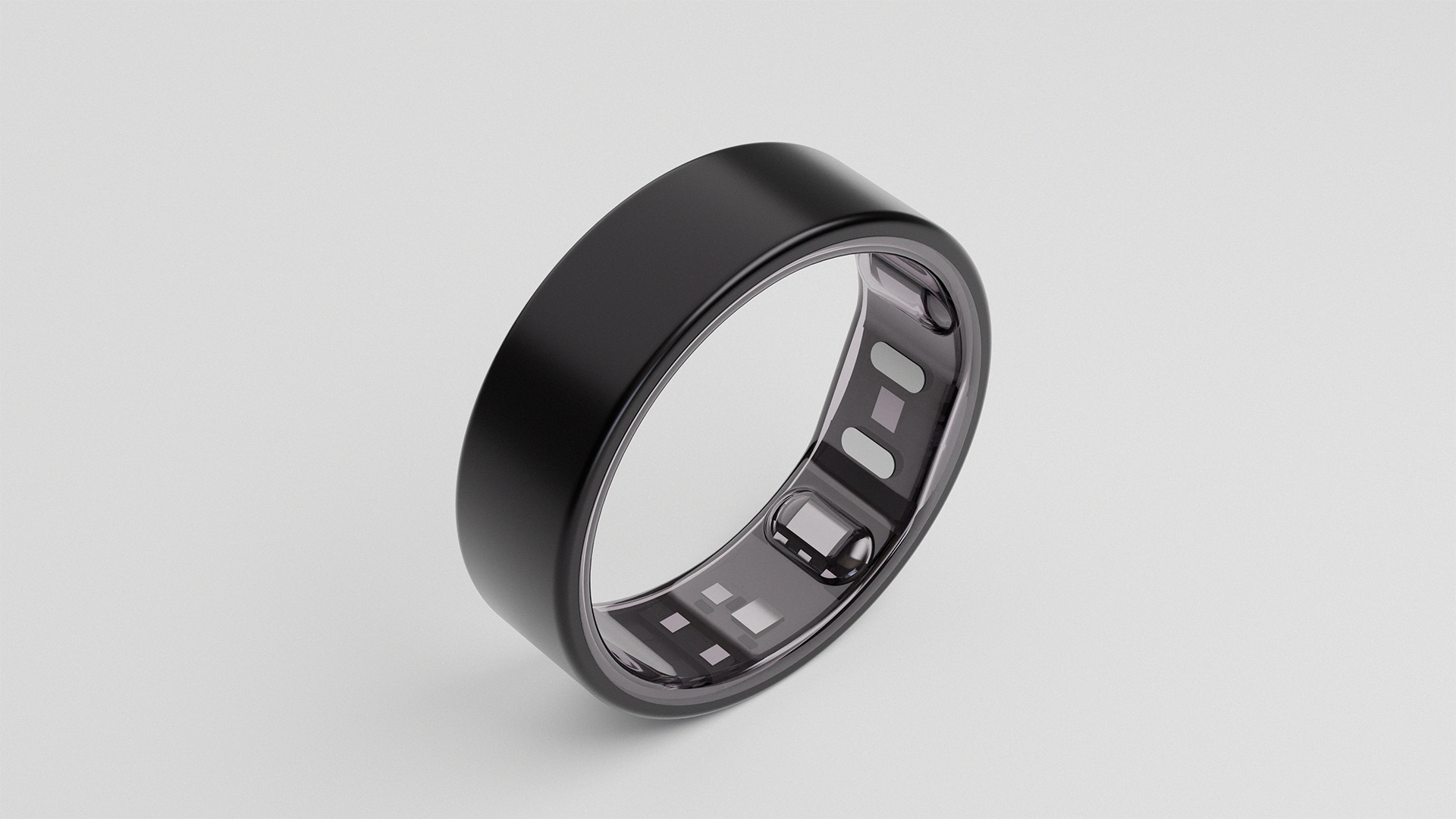
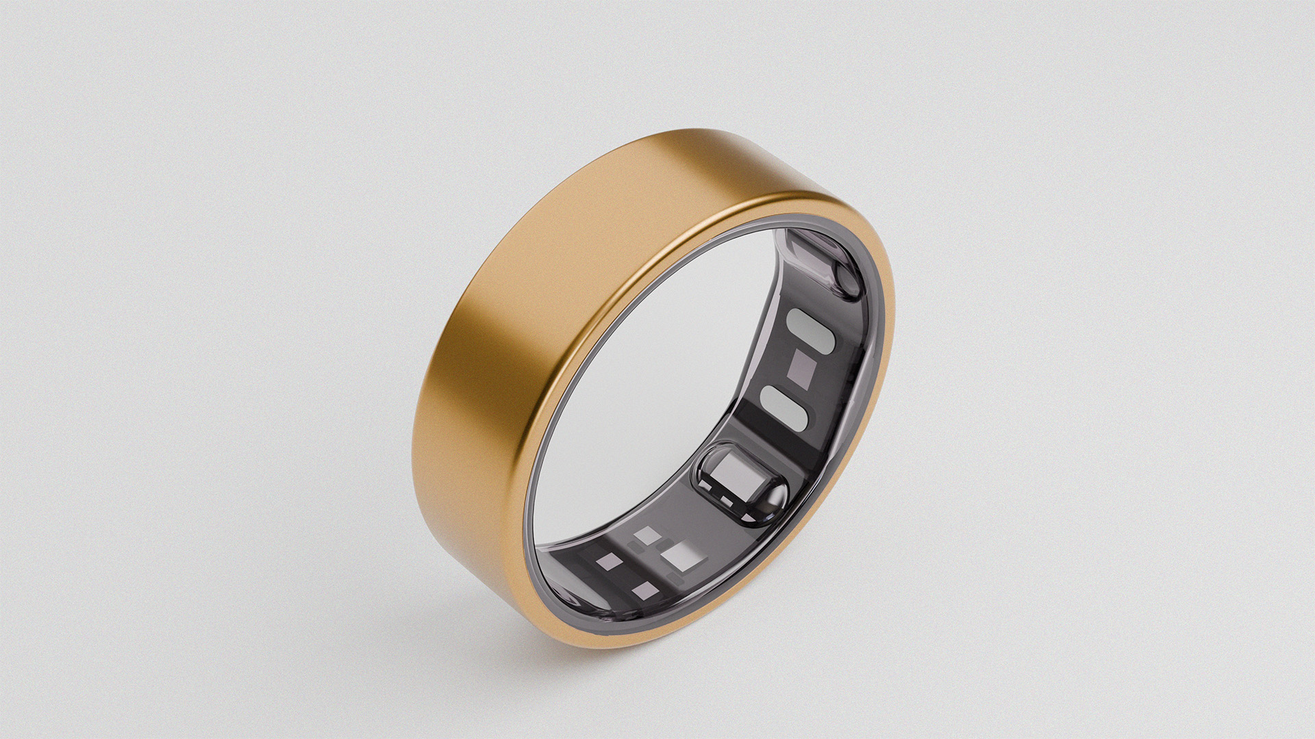
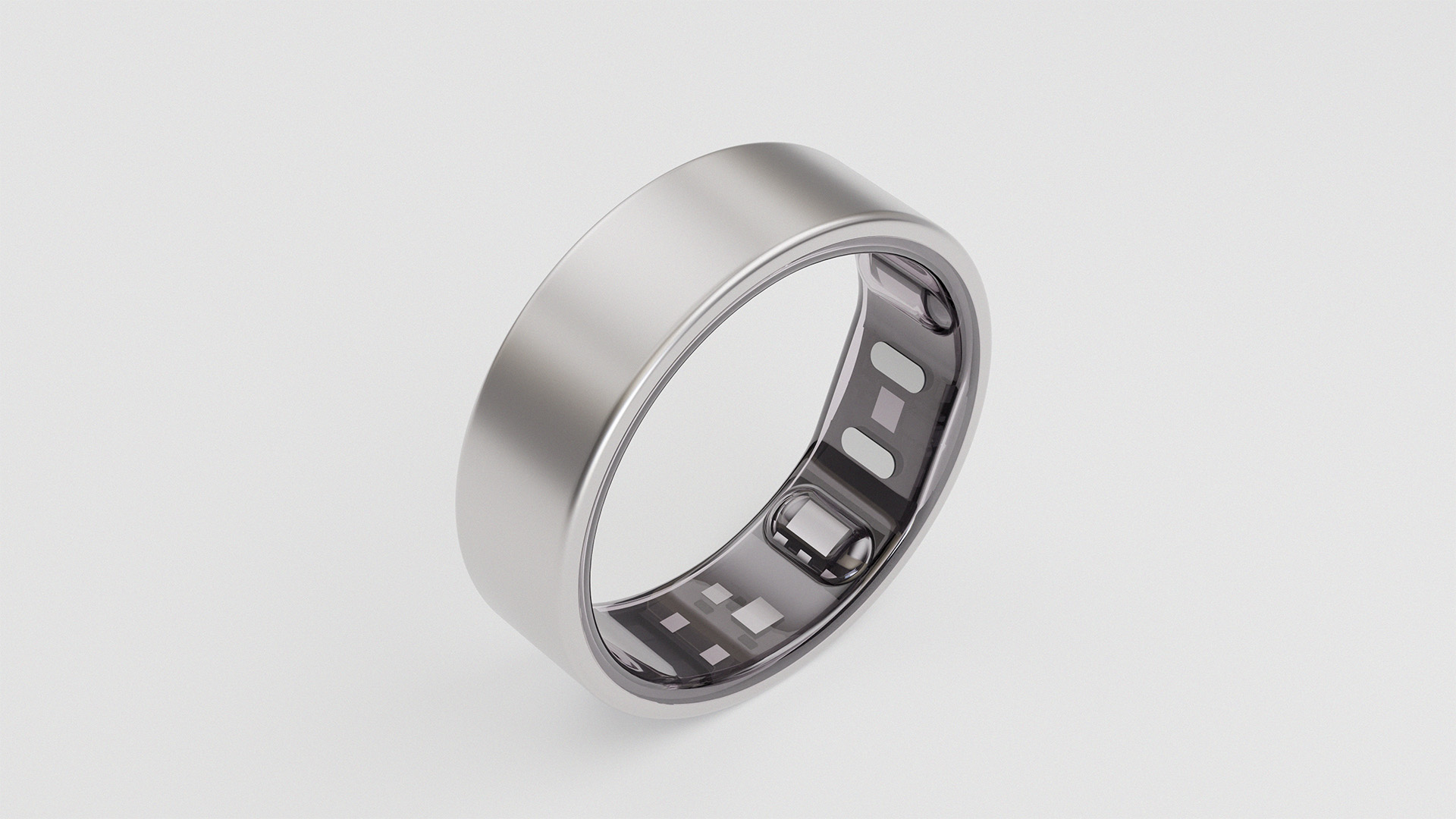
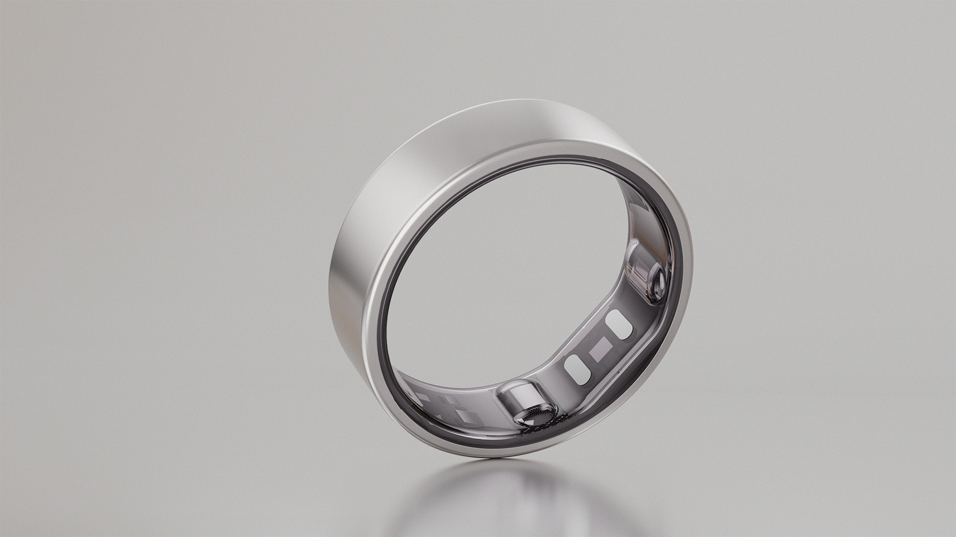
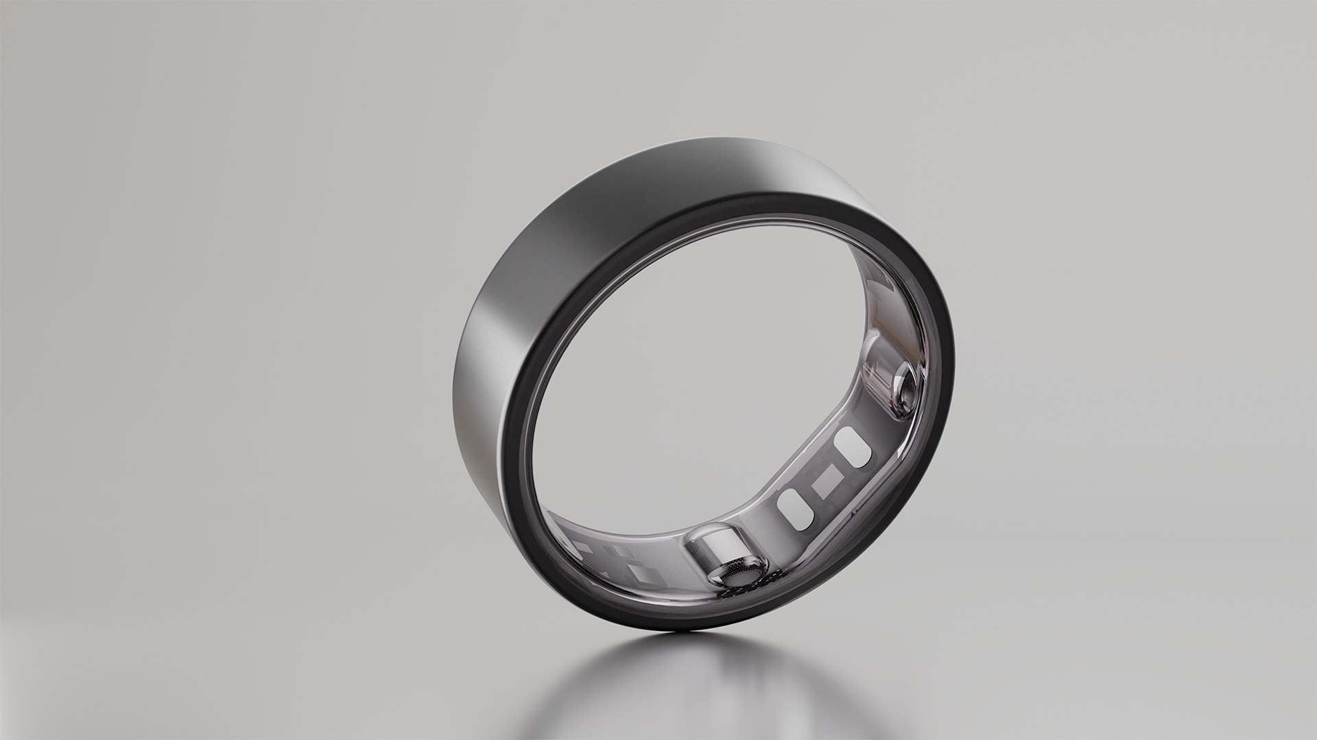
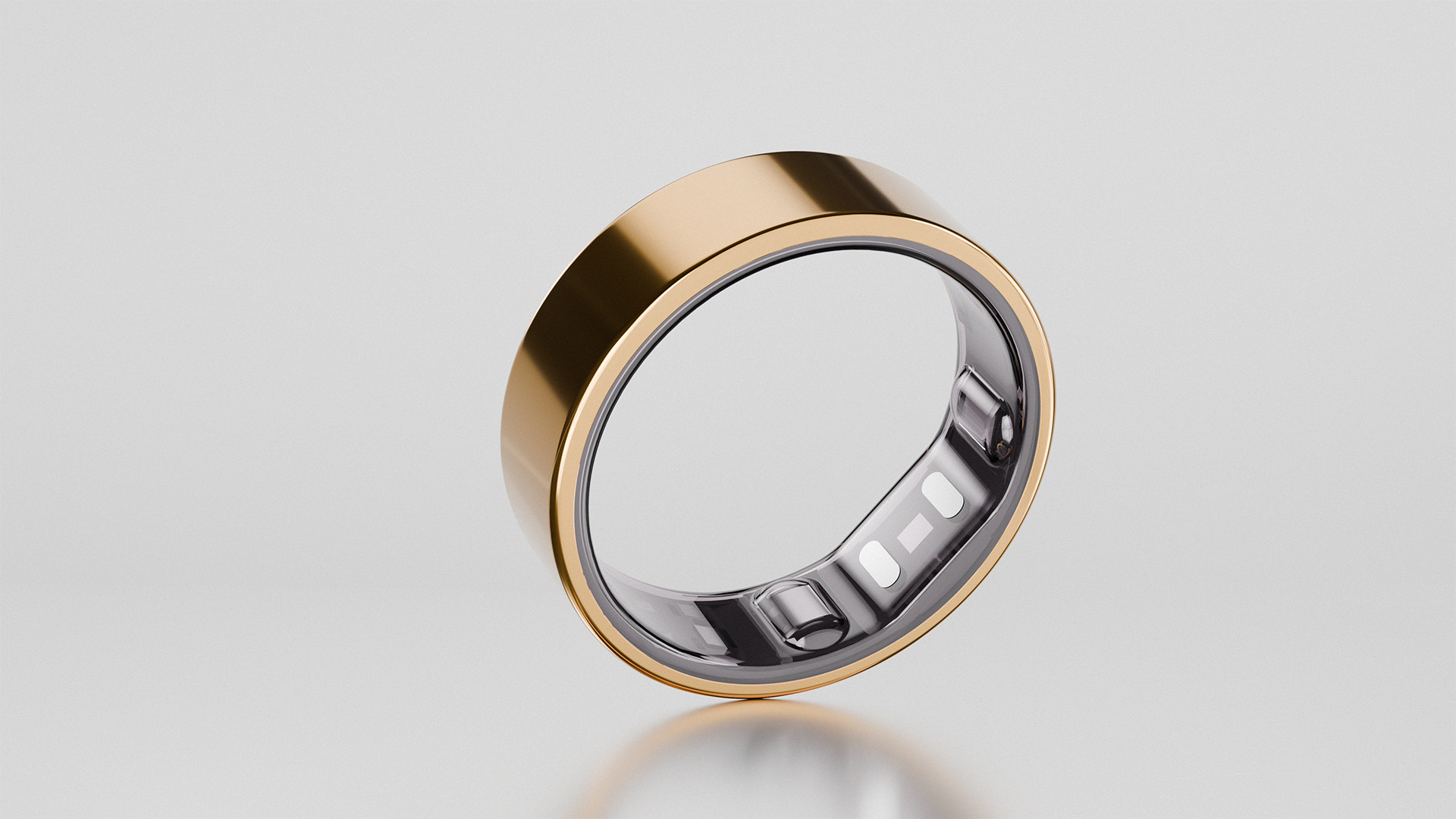
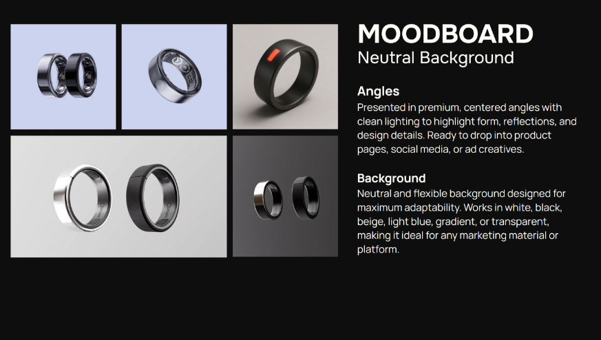
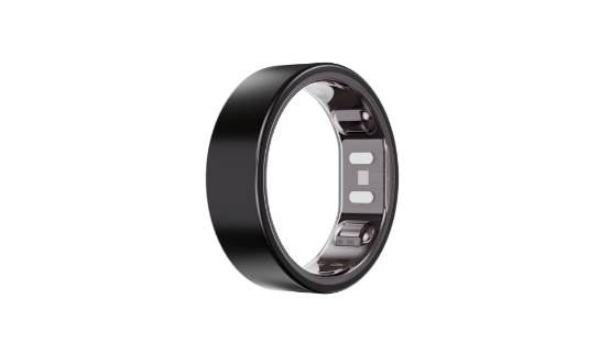
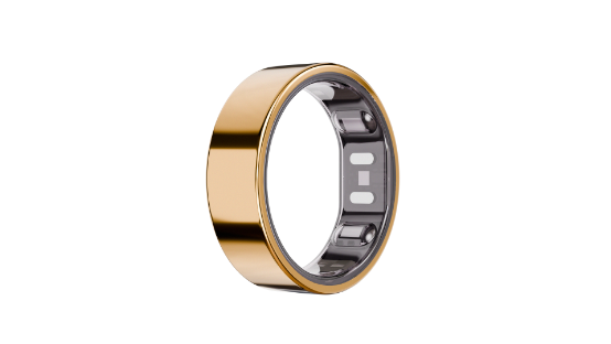
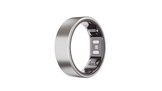
Neutral Direction:
- The first direction focuses on control.
- Clean compositions. Centred angles. Minimal backgrounds.
- Nothing competes with the product.
- Every reflection, every edge is intentional.
- This is where clarity lives.
Product pages. Ads. First impressions.
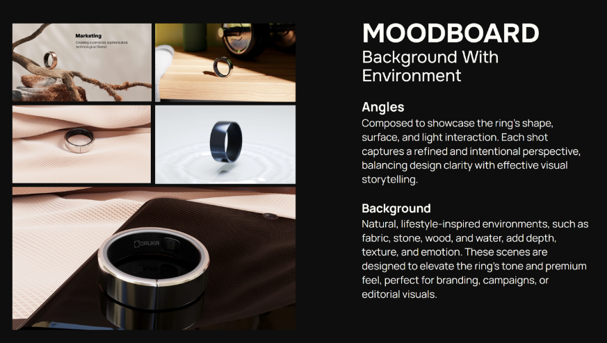
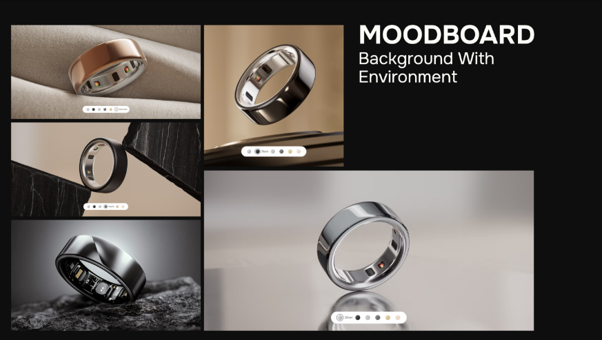
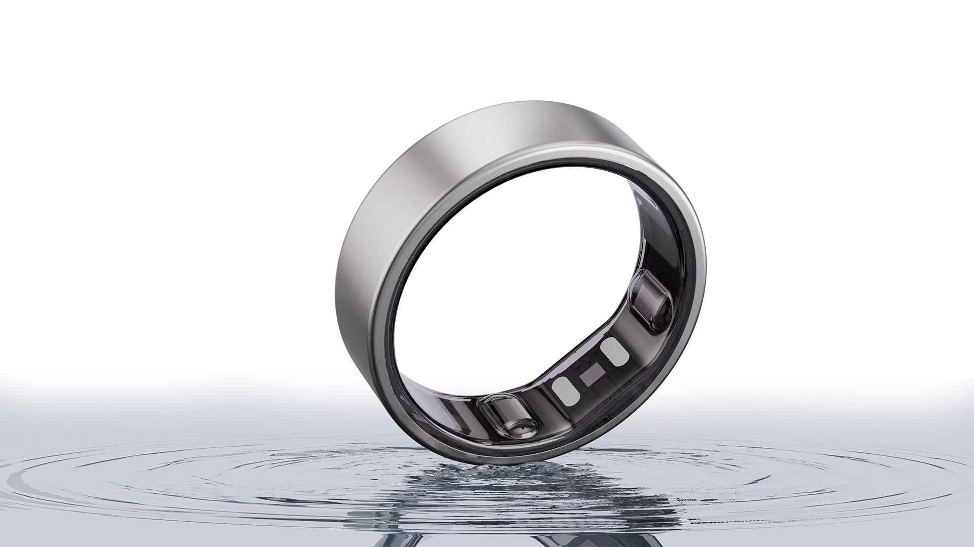
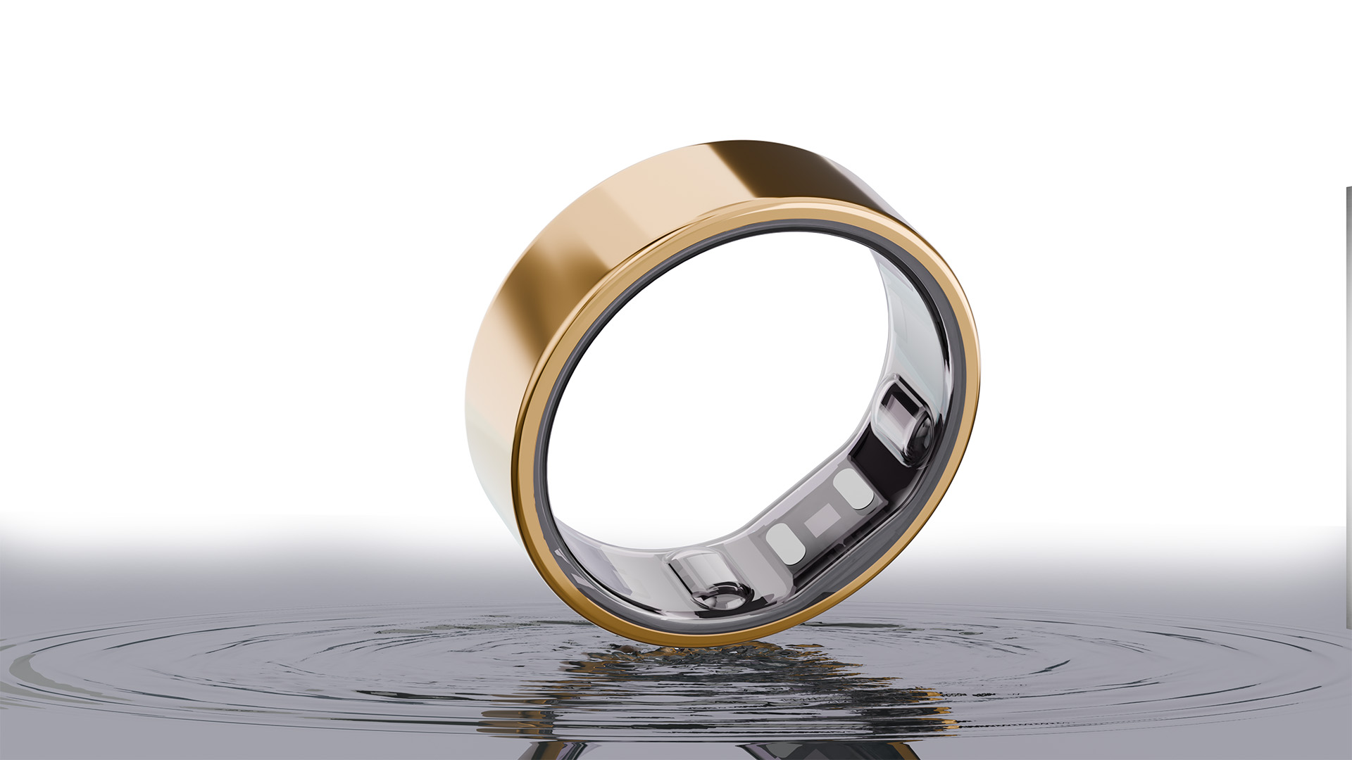
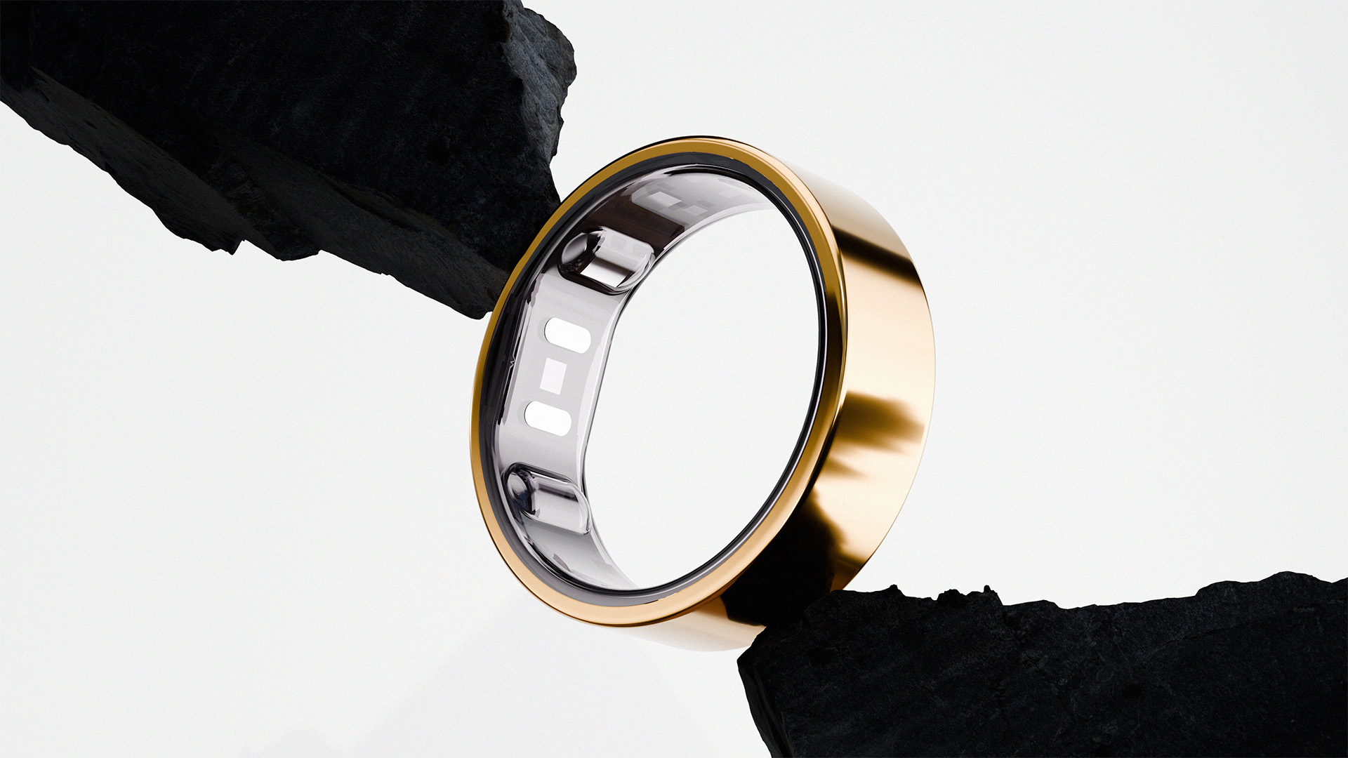
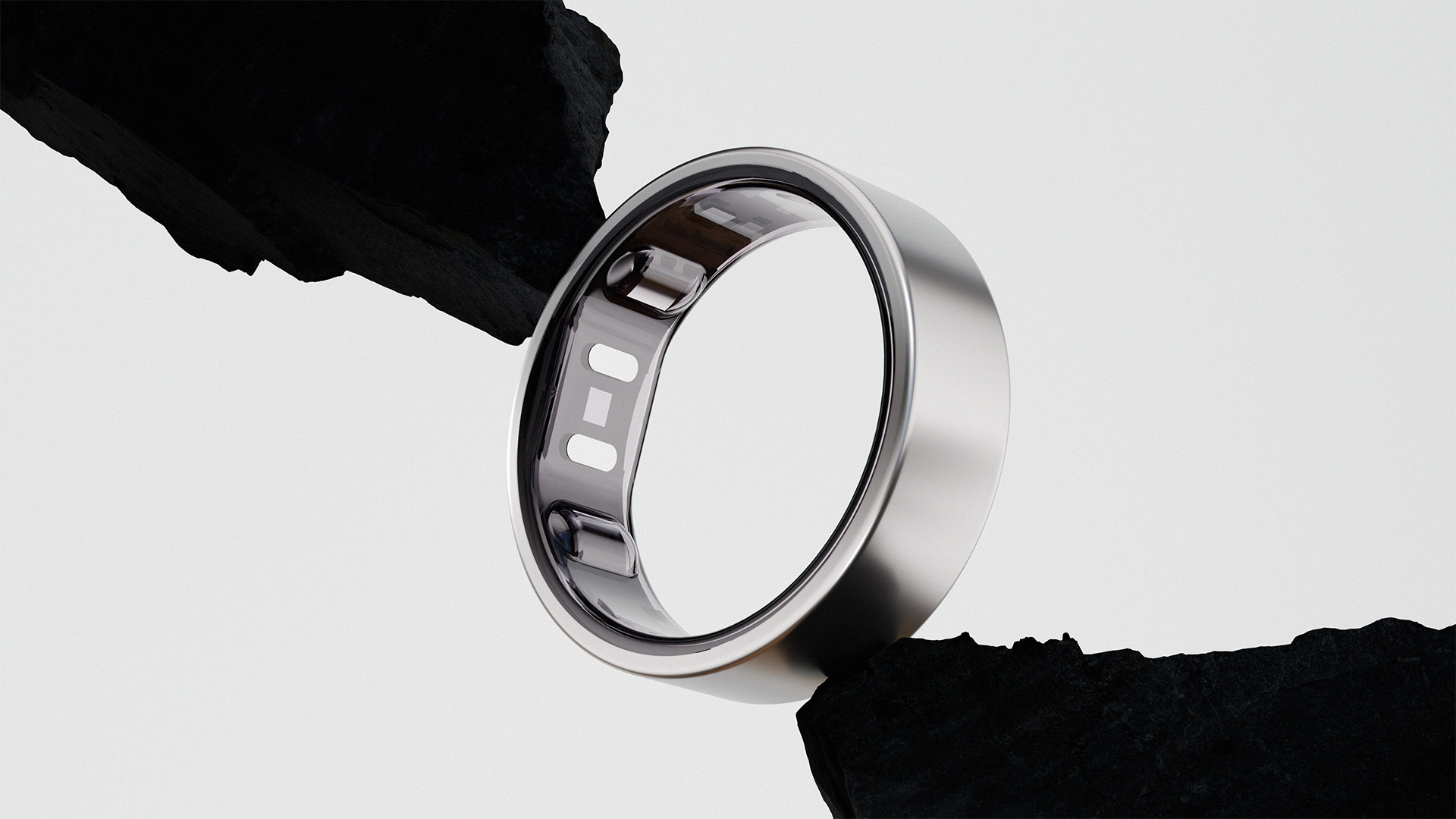
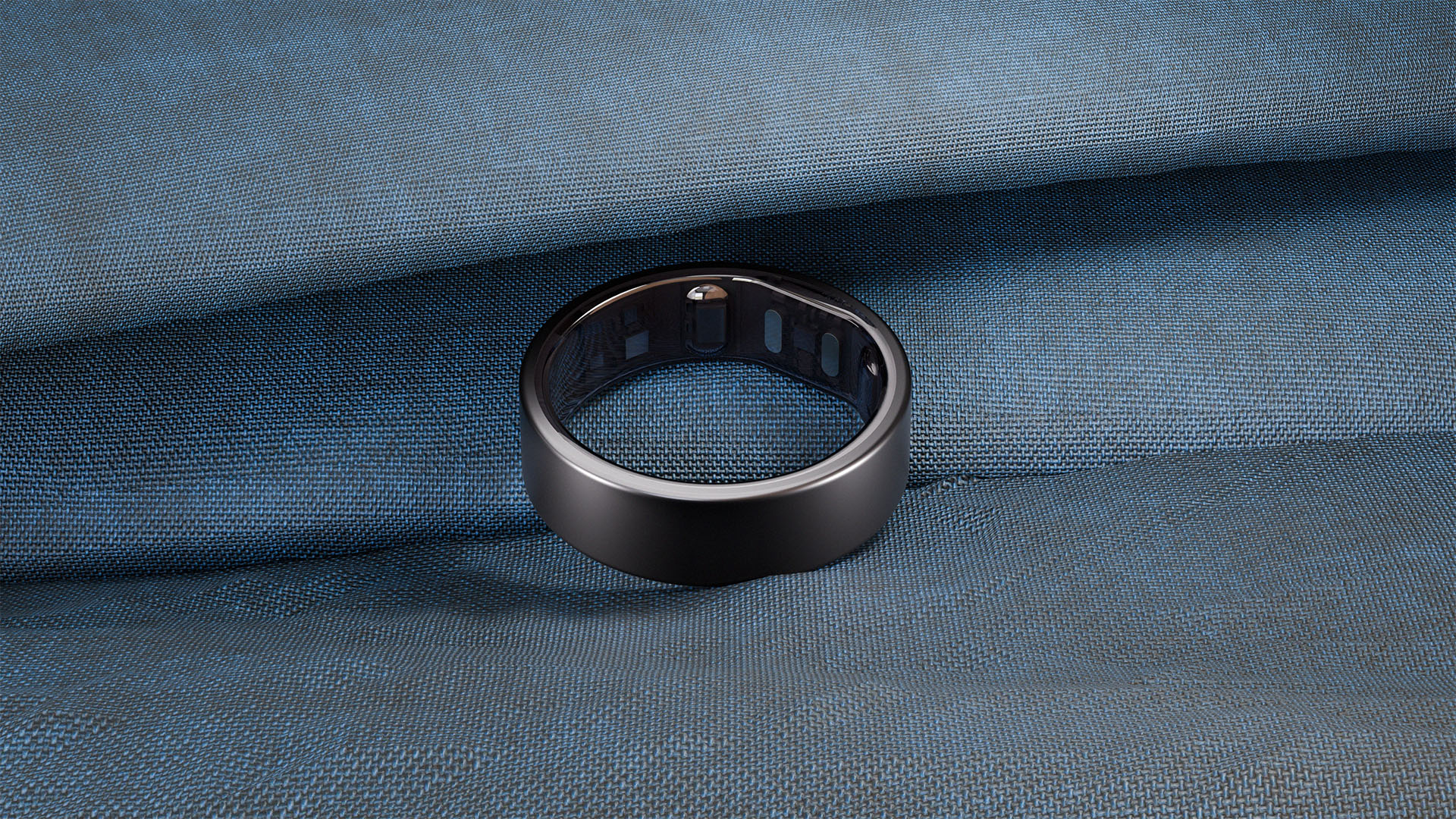
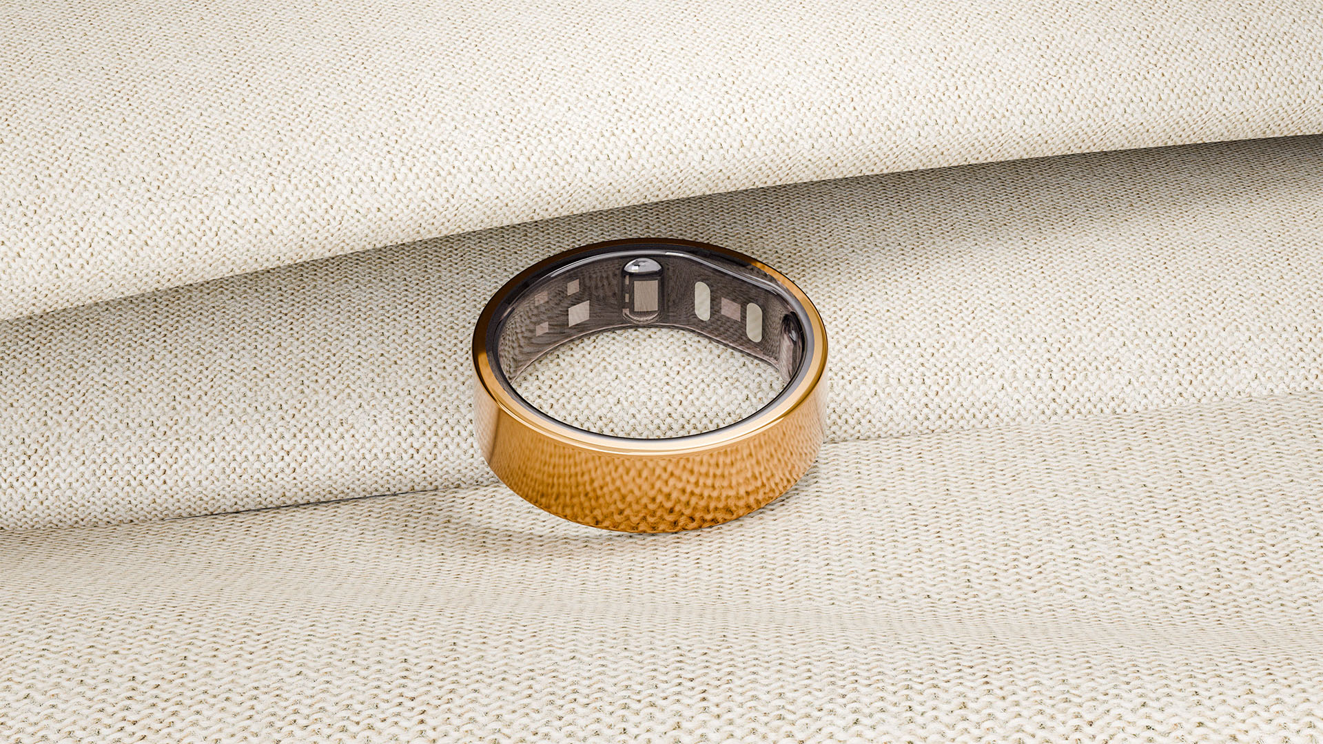
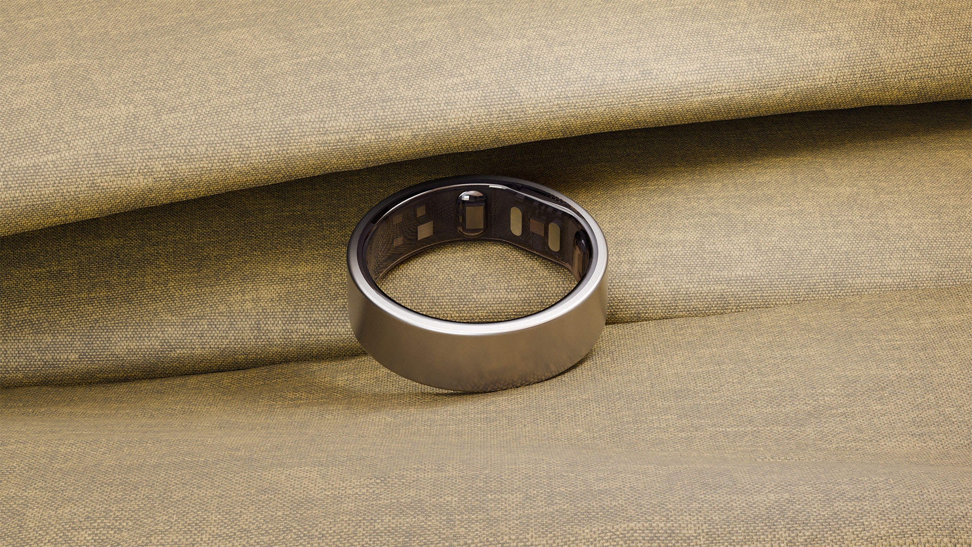
Environment Direction:
- The second direction introduces context.
- Materials like fabric, stone, and water bring subtle emotion into the visuals.
Environment Direction:
The product starts to feel part of a lifestyle, not just an object.
Still controlled. Just more expressive.
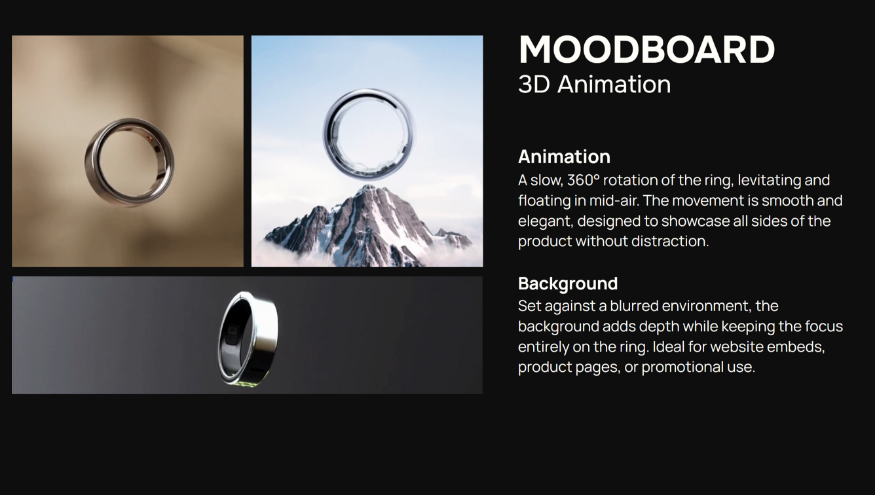
Motion Direction:
- Motion stays restrained.
- No unnecessary movement.
- No distraction.
- A slow rotation, clean lighting, and full visibility of the form.
- The goal is simple. Let the product speak.
Creative Direction
- The focus shifted to materials first.
- Not exaggerated. Not overdesigned.
- Just surfaces that respond to light naturally.
- Subtle reflections, soft transitions that defined edges.
- The product should feel real before you think about it.
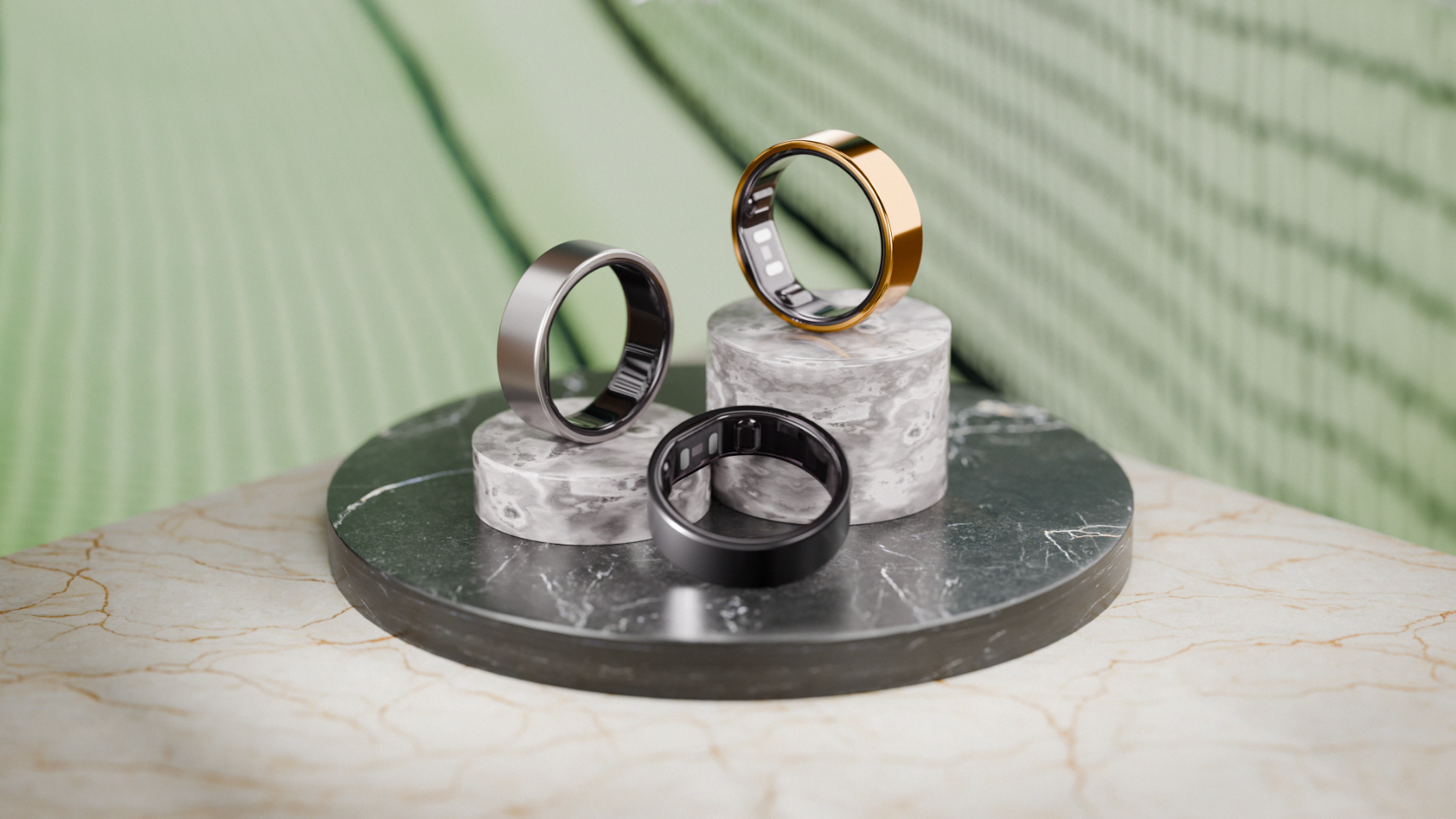
Environment System
A single setup wouldn’t be enough.
The product needed a range.
- Soft environments introduce comfort.
- Water adds energy.
- Stone brings weight.
- Fabric gives lifestyle, comfort, and everyday wear
- Marble elevates the tone.
Each scene does one job.
Together, they create flexibility across campaigns.
Animation
Static shows the product. Motion reveals it.
A controlled rotation. Nothing more.
Enough to understand the form.
Nothing to distract from it.
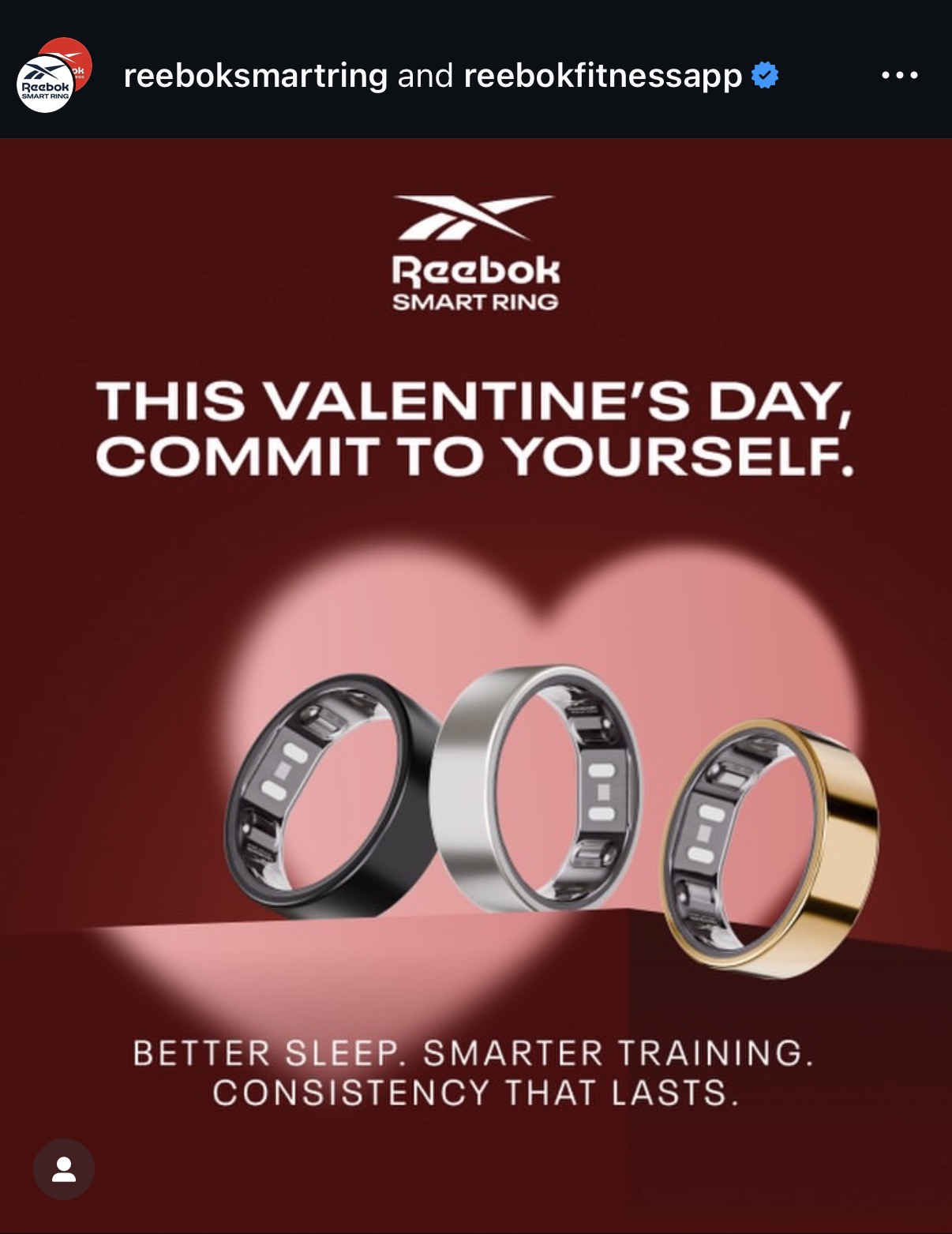
Campaign application
Result
The product is no longer just functional.
It feels considered, refined, something that belongs in everyday life.
That shift matters.
Because when a product feels right, people don’t question it.
They choose it.
If your product sits between performance and design, it needs visuals that communicate both instantly.
Not just how it works.
But why it matters.
Available for select projects.
Role:
3D Artist
Art Direction